It is uncontroverted that the Bars in Africa all have creatively inspired and iconic logos. From reflecting the soberness of the profession to representing the free spirit of Africa, these logos featured by Courtroom Mail have it all.

But can graphic designing of logos ever go overboard? Is it possible to overload a symbol with too many ideas? Can a logo be too basic and boring to interest the average person to want to know more about a body?
Can a logo be scary enough to make people fear or respect a profession? Can a logo be so glamorous that the mere sight of it makes people want to join a professional group?
The logos, which Courtroom Mail has given prominence, from some sub saharan African Bars across the beautiful Mother Continent gives an affirmative answer to all the questions above.
Courtroom Mail editors, however, agree that the Logo of the Law Society of Kenya is the most unattractive followed by that of Lesotho and Botwana.
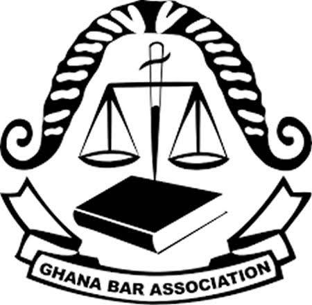
Coming fourth from the bottom is that of Zimbabwe while that of the Ghana Bar is 5th from the the bottom.
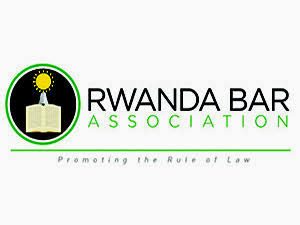
However the editors are unable to agree on which one is the best between the logos of Rwanda Bar Association, The Law Society of Swaziland, Ethiopia Lawyers association and the law society of Namibia.
Sign up to register for the IBA African Regional Forum conference in Addis Ababa 1-3 April 2020
Readers will now vote to select the winning logo which will be announced later in the month.
Just go to the comment section below and name three Bar associations that should be considered the three best. Only comments that suggest three bars will be taken into consideration so if your vote should count,you must suggest not less than or more than three bars.

Ghana 
Namibia 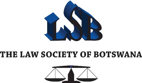
Botswana 
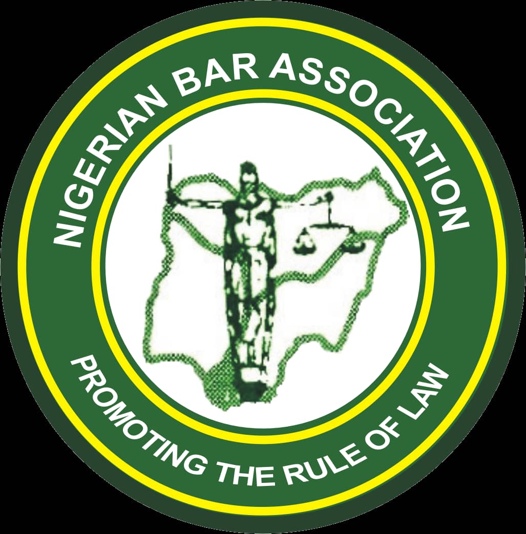
Nigeria 
Lesotho 
Kenya 
Tanganyika (in Tanzania) 
RSA 
Rwanda 
Zambia 
Swaziland 
Malawi 
Zimbabwe 
Uganda 
Sign up here and get listed for free on Africa’s biggest expert list of lawyers.


